

What Do the 25th and 75th Percentiles Actually Tell You? Understanding Test Scores on the Common Data Set
When a college publishes its middle 50% score range, most families interpret it at face value. If a school's 25th percentile is 1250 and its 75th is 1410, they assume those numbers describe a typical cross-section of enrolled students. They don't. In the test-optional era, those numbers have become quietly, significantly misleading.
Here's why.
The Math Behind the Percentiles
Take Penn State as a case study, using the 2024-25 Common Data Set enrollment data. Penn State reported a 25th/75th percentile range of 1250 to 1410. What PSU did not headline: only 36% of enrolled students submitted test scores. The other 64% withheld scores.
Now ask yourself a simple question. Why would a student withhold scores? There are a few possible reasons, but the most common explanation is that the student’s scores were below the school's 25th percentile. It's hard to imagine a student with a 1350 not sending that score to Penn State.
So let's follow the math:
Finding the Real 25th Percentile
If 64% of students withheld scores, and the reasonable assumption is that most students withheld scores because those scores were low, then the 1250 "floor" is not really a floor. It's a floor for the (roughly) one-third of students who submitted.
To estimate the true percentage of enrolled students with scores at or below 1250: One quarter of the 36% of submitters scored below 1250, so 9% of all enrolled students submitted scores below 1250. Then, let’s add the 64% of non-submitters, assuming that most, if not all, of them had scores below 1250. Adding that 9% to 64% puts roughly 73% of all enrolled students at or below a 1250.
So when Penn State publishes 1250 as its 25th percentile, the number that more honestly describes enrolled students is closer to the 73rd percentile.
Finding the Real 75th Percentile
The flip side is even simpler. Any student scoring 1410 or above should obviously submit to Penn State, so nearly all of those students are captured in the submitting group. One quarter of the 36% who submitted scored 1410 or above, which again is 9%. That means 1410 represents the top 9% of all enrolled students, not the top 25%. What's listed as the 75th percentile is really closer to the 91st.
A Note on Assumptions
All of this rests on one key assumption: that students who withheld scores did so because their scores were below the 25th percentile. It's fair to acknowledge that some withholders may have scores between the 25th and 50th percentiles, which would bring these estimates back slightly toward the published numbers.
But there's another factor that more than offsets that possibility.
Enrolled Does Not Equal Accepted
The students whose data shows up in the Common Data Set are enrolled students. These are the students who chose Penn State. This is a very different, and likely less statistically impressive group, than the group consisting of all of the students Penn State accepted.
Accepted students, as a pool, tend to be stronger. High-achieving applicants get into many schools and turn down all but their top choice.
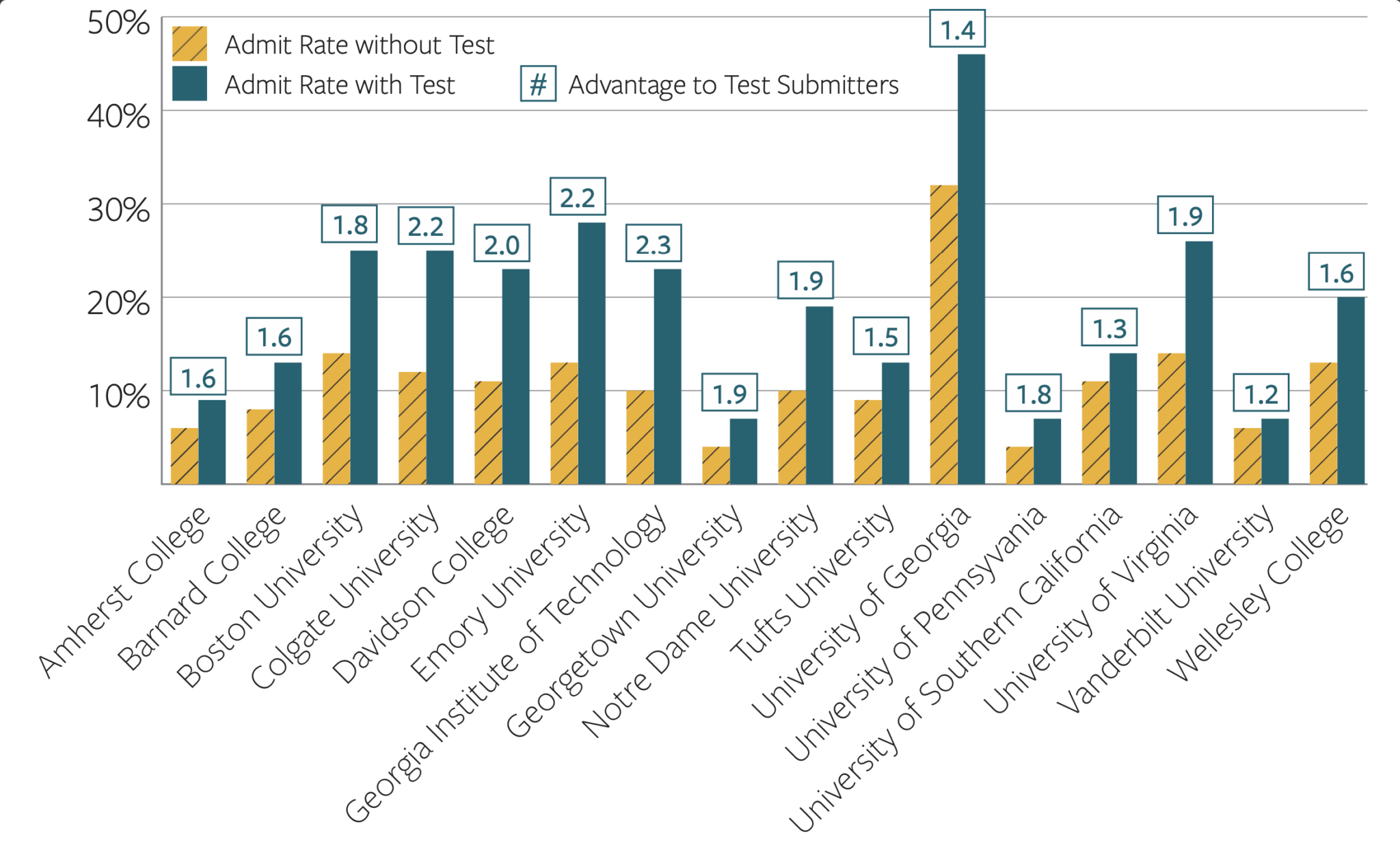
Common Data Set data only shows us enrolled student data. We don't have direct data on accepted applicants, so we can’t say with complete certainty that accepted students submitted test scores at a much higher rate than enrolled students. But we have strong clues.
When test-optional policies were new in 2020 and 2021, many colleges released detailed breakdowns of their applicant and admit pools, including testing data on students who applied with and without scores. Then they stopped releasing that data. The reason colleges stopped is not subtle: the data showed that students who submitted scores were being admitted at substantially higher rates than students who did not.
The Takeaway
The Common Data Set tells you about the students who enrolled. If you could see the data for all accepted applicants, it would almost certainly show a much higher percentage of test submitters, and higher scores among them. Strong test scores get students accepted at a lot of schools. That's not speculation. Colleges themselves confirmed it, briefly, before deciding they'd rather not discuss it.
The published 25th and 75th percentiles are not fabricated. But in a world where 64% of students don't submit scores, those numbers describe a narrow slice of the class. Reading them as a full picture of who gets in is a mistake that can lead families to seriously underestimate how good their scores are, and how much a strong test score can matter.